website design tips for beginners
// Website Design
You don't have to be or hire a designer when you follow a proven system to create your website.
I teach many shortcuts and strategies that you can implement right away to get a beautifully designed website.
Just maybe...
- You are struggling with your website design.
- You are stuck choosing the right fonts or color palette.
- You are just plain overwhelmed by all of the decisions that go into good website design.
If this sounds like you, keep reading because in this post you will learn website design tips for beginners that are proven to keep your readers engaged, decrease your bounce rate, and convert more visitors into subscribers and ultimately customers.
Here are my top 5 tips for beginner website design:
- Keep It Simple
- Limit Distractions
- Use White Space
- Keep Branding Consistent
- Include Quality Graphics
1. Keep It Simple
My number one website design tip for beginners is to keep it simple.
Good website design should immediately get your visitors attention and make it easy to accomplish what it is that you want them to do: sign up for your email list, purchase an eBook, apply for your membership, enroll in your online course, etc.
Has this ever happened to you?
You're scrolling through Pinterest late at night and you click on a fancy pin that claims to teach you how to bake the best chocolate cake, but when you land on the web page it is unclear what the website is about or you aren’t really sure what to do next?
I see some hands going up out there!
Yep, this has happened to me...more than once.
And boy is it frustrating!
You may know how the story ends: You quickly exit out of that website and find your way back to Pinterest in hopes of finding an easy to navigate and uncluttered website that will help.
If this sounds like something that you’ve experienced, you are not alone.
Next, I share some easy ways to fix common website design mistakes made with the layout, above the fold and the navigation.
LAYOUT
Your website layout is the way in which you arrange the visual elements on your web page.
“A simple and uncluttered website design is the most effective way to keep your readers engaged."
It is easy to get carried away and start adding unnecessary and distracting elements to your web pages. Some examples are Twitter or Facebook feeds, multiple videos, pop-ups and advertisements.
Remember to keep it simple, especially in the beginning.
Click here to download your FREE Website Design Planner. You will get immediate access to sample layout pages like the one shown below to help you get started.
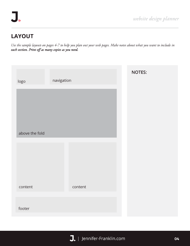
ABOVE THE FOLD
The area of your web page that is visible to your visitor when they land on your website is considered above the fold.
Your website visitors have short attention spans; this means that you only have a few seconds to grab their attention.
With that in mind, it should be immediately clear what your website is about and what you want your visitors to do when they arrive on your web page.
One way to accomplish this is through an attention getting headline in bold text and a button with a strong call to action that entices your visitor to click on it.
Below is an example of a good call to action that appears above the fold:
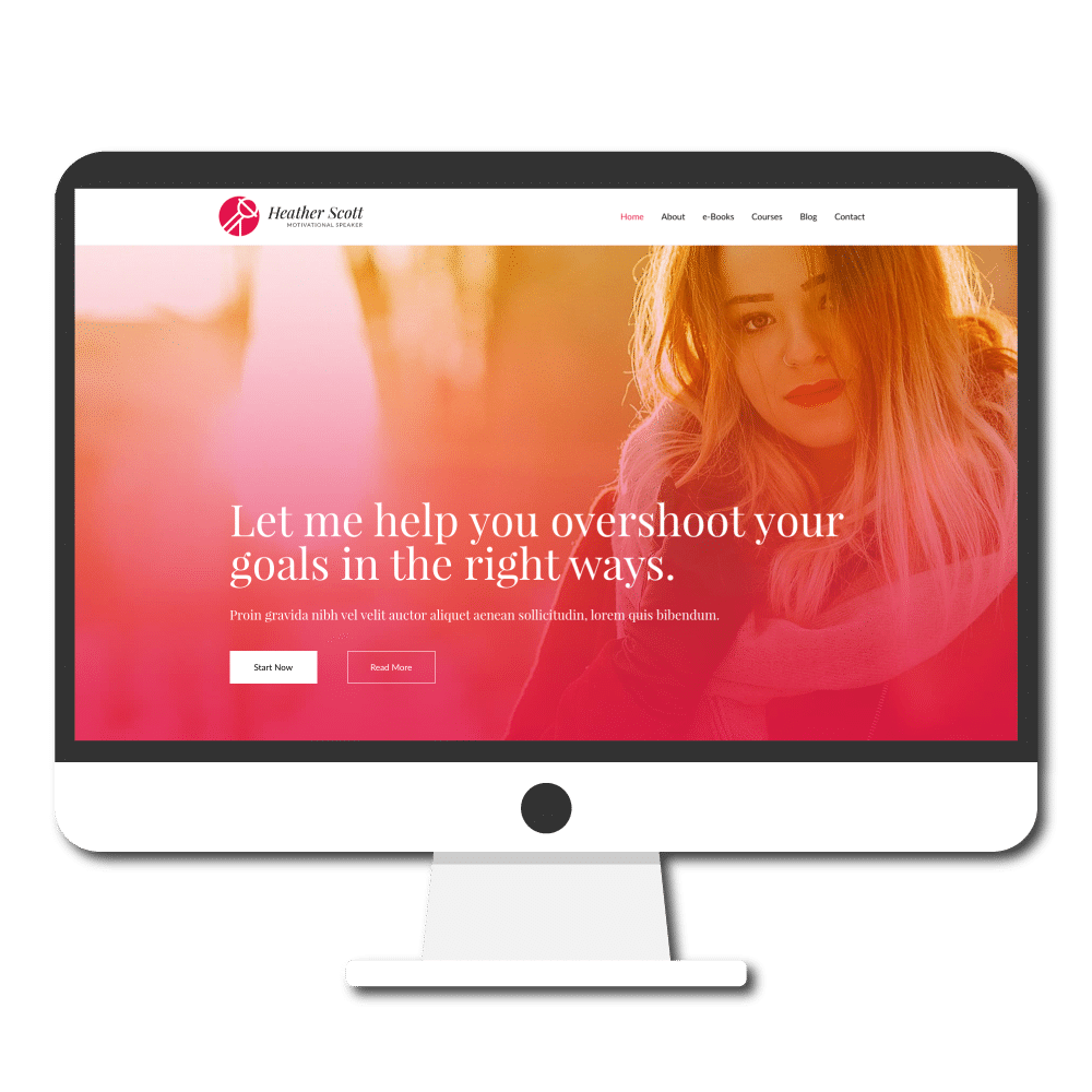
READY MADE WEBSITE | CLICK HERE to purchase this professional website design that you can customize to make it all your own.
NAVIGATION
Navigation is essential to your website design. A well thought out navigation menu makes it easy for your visitors to find their way around your website.
You may be tempted to add a fancy Mega Menu or lots of drop down sub-menus.
Just don’t do it.
Keep your navigation menu links simple and use wording that makes it clear what each web page is about; include links to important pages such as your home page, about page and contact page.
I use a START HERE link in the navigation which immediately tells visitors where I want them to start.
Another effective website design idea is to use a button in your navigation to entice visitors to take the next step. A good example of this is a GET STARTED or APPLY NOW button added to the top right hand side of your navigation menu.
In addition, be sure to include your primary navigation on every web page and make it easy for your visitors to get back to where they started.
If you have a large website it may make sense to include additional links in the footer or sidebars.
2. LIMIT DISTRACTIONS
Your visitors are easily distracted.
Have you ever tried to scroll through a blog post that was littered with pop-ups and advertisements every other sentence?
I know I have.
It's like being at Disney World with multiple attractions competing for your attention.
You're thinking, "Which ride should I ride first?"
It's the same when you are on a web page: which link or button should I click on first?
Limit distractions and make it easy for your visitors to read your content and take the next step.
Here is a website that I clicked on from Pinterest:
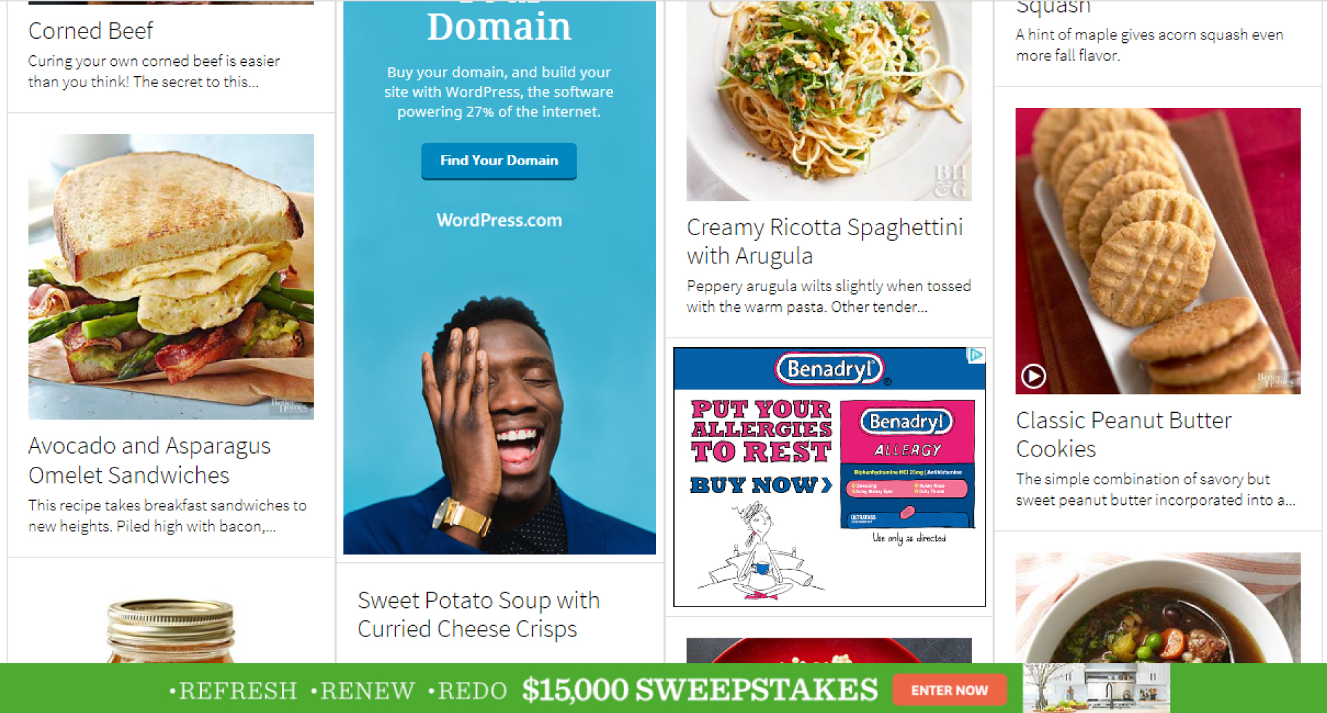
Recognize it? The ads and pop-ups are distracting and make it impossible to get to the content and that leads to a frustrating user experience.
You may be tempted to plaster your website with tons of advertisements and affiliate links.
If your goal is to send your visitors away from your website and make a few cents through pop-ups, advertisements and affiliate links, then by all means go ahead and plaster away.
If, however, your ultimate goal is to convert your visitors into subscribers and customers, then the last thing you want to do is send them away from your website never to be seen again.
PRO TIP: Provide your readers with tons of valuable content and help them solve a problem; they will be back for more.
Let your readers get to know you and work to grow your audience; not that of your affiliates.
In the end, you will be building a business with engaged visitors and customers for life.
3. WHITE SPACE
White space is also known as “negative space”. It refers to the blank space around the elements on your web page.
White space doesn’t necessarily have to be white either.
Confusing, I know.
I like to think of the white space on your web page like a pause at the end of a sentence.
When you’re reading your child a good night story, does it make sense if you run all of the sentences together without stopping to pause at the end?
The answer is no.
(Ok, ok, you got me. There is that one exception when you are so exhausted you just can’t keep your eyes open any longer and it would be best for everyone if you hurried through the story of The Hungry Caterpillar for the millionth time.)
However, when considering good website design it is OK to give your readers eyes a break and allow them to take in your content.
When the visual elements on your web pages have white space in between, your amazing content is highlighted and takes center stage.
PRO TIP: When it comes to website design, less is more.
Allow your content to breathe.
Go ahead, add an extra space after that paragraph.
Leave some space around your images. Your readers will thank you for it.
4. CONSISTENT BRANDING
Another important web page design tip is to keep your branding consistent.
Why is consistent branding for website design important?
Branding includes elements of your website design that is specific to your business including your logo, fonts, colors, documents, etc.
It is important to keep your website design consistent with your overall brand because you want your website visitors to immediately recognize that they are stepping into your virtual business when they land on your web page.
If your social media, business cards, marketing materials or shop look nothing like your website design, then you will quickly confuse your visitors and they are likely to leave as soon as they arrive.
On the other hand, if all of your branding is consistent and professional, your visitors will begin to associate and recognize your brand in a sea of many.
LOGO
Be sure to include your logo above the fold on your website.
Two common places for your logo are either left-justified or centered at the top of your web page.
Another place where you can customize your website design further is with a Site Icon.
A site icon, or favicon, is a small image that appears in the browser tab to the left of your website title.
Maybe you don't have a logo or your logo is in need of a makeover?
If your budget is not limited, hire a designer to create your brand identity.
The designer will work with you to create your logo, fonts, colors and overall feeling of your brand that will be memorable and attract your target market.
If you have a limited budget, I would invest in the best that you can afford.
Your logo is the visual identity of your brand.
It is often what people think of when they hear your business name and you want it to be memorable.
Here are some resources:
DesignCrowd is a website of freelance designers where you can get multiple logo designs submitted by different designers and you choose your favorite.
Creative Market is another resource where you will find many Logo templates for sale that you can customize.
If you want to DIY your logo design, Canva has a free logo designer where you are able to choose from multiple pre-designed templates.
PRO TIP: Once you have decided on a logo design, use it on every piece of material that you produce for your business: business cards, brochures, flyers, emails, website, social media graphics, profile pictures, etc.
FONTS
In order to keep it simple in the beginning, I recommend that you stick to 3 fonts max:
- logo font
- heading font
- content font
The logo font is used for the text in your logo.
The heading font is used for all of the H1, H2, H3 (and so on) headings on your website.
The content font is used for all of the paragraphs of text or body of your website.
Not sure the best font combinations for your website design?
I get it.
Choosing the right font combinations for your website design can be tricky, but you don't have to go it alone.
Thankfully, there is a Google Chrome Extension that can help.
Cue the drum roll, please…
WhatFont is a Chrome extension that will tell you what font is used on a website.
Use WhatFont to find out the fonts that are used on a particular website just by hovering the WhatFont cursor tool over the different fonts on the web page.
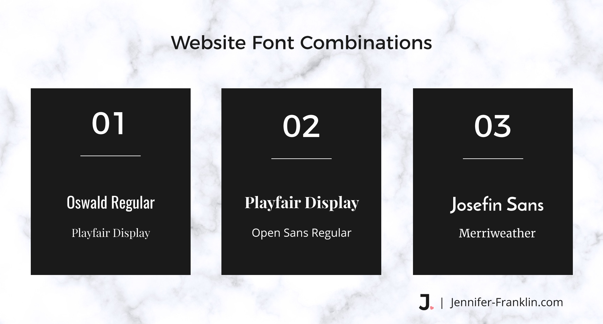
Here are three of my favorite website font combinations right now:
You may start to feel limited by 2-3 fonts.
Keep in mind that you can create interest with one font by using bold, italics, different letter spacing, and letter cases.
Here are some examples:
BOLD
italics
L E T T E R S P A C I N G
lowercase
UPPERCASE
The combinations are many with just one font!
If you're still stuck picking out your website font combinations, do a quick search on Pinterest.
There you will find many font pairings for inspiration.
PRO TIP: Skip the script. It may seem fun and playful to use curly fonts or fancy script; however, if your visitors can’t read your content then they will bounce.
Reserve those fancy fonts for your headings and use sparingly if you absolutely must.
COLORS
Just like fonts, I also suggest that you stick to 3 colors max:
- primary color
- neutral color
- call to action color
First, the primary color will be your overall brand color.
Think for a minute about some popular brand logos: McDonald's, WalMart, Target, Amazon.
Now what colors do you associate with each brand? If you guessed the following you are correct!
- McDonald's - Yellow
- WalMart - Blue
- Target - Red
- Amazon - Orange
This exercise proves how important it is to choose a primary color for your brand and to use it consistently.
Next, shades and tints of your neutral color will be used as backgrounds and text. A neutral color can be black, gray or brown.
Finally, the call to action color should be a bold color and used sparingly.
You want this color to stand out when you want your visitors to take action.
Use it for headings, important backgrounds, links, and buttons.
An example is for buttons that you want your visitors to click.
Using your call to action color will make the buttons pop.
Plus, your readers will begin to associate your call to action color with taking action.
Not sure what colors look good together on a website?
ColorZilla is another Chrome Extension that can help.
There is no need to reinvent the wheel here.
Look to websites or images on the web that you like and use the ColorZilla extension to find out the colors that are used.
PRO TIP: It doesn’t have to be overwhelming to keep your branding consistent. Stick to the recommended number of fonts and colors.
You can write them down in your FREE Website Design Planner so that you have them handy when you need to refer to them. Click here to download.
5. Graphics + Images
It is super important to use quality graphics and images in your website design.
Consider this:
- Content with relevant images gets 94% more views than content without relevant images.
- Having at least one image in your post leads to double the shares on Twitter and Facebook.
Images that are too small, pixelated or unrelated to your content will make your website design look unprofessional.
Not a pro photographer?
Do not fret!
There are many free and paid stock photo websites out there for you to find quality photos, illustrations and vector graphics to get your website design started out right.
RELATED | Low Cost Stock Images
A common mistake is to upload large photo files directly to your website.
Doing so takes up space on your server and may cause your web pages to load slow.
The best thing to do is to use a photo editing software such as Photoshop to save your images at 72 ppi before you upload them to your website.
An alternate solution for WordPress users is to install an image optimizing plugin such as Imagify to optimize your images after you upload them to your website.
PRO TIP: My favorite place to find stock photos, illustrations and vector art is Pixabay. There are thousands upon thousands of images and fresh content is added daily.
TAKE ACTION
Whether you decide to design your own website or hire a website consultant like myself, I hope you take action and implement my best website design tips for beginners today.
When in doubt, refer back to website design tip #1 and keep it simple.
I hope you found these website design tips for beginners useful.
Let me know in the comments below.
![]()
SAVE FOR LATER > PIN ME!


